> ## Documentation Index
> Fetch the complete documentation index at: https://learn.nexudus.com/llms.txt
> Use this file to discover all available pages before exploring further.
# Store
> The browsable product catalogue where members discover and select products.
# Store
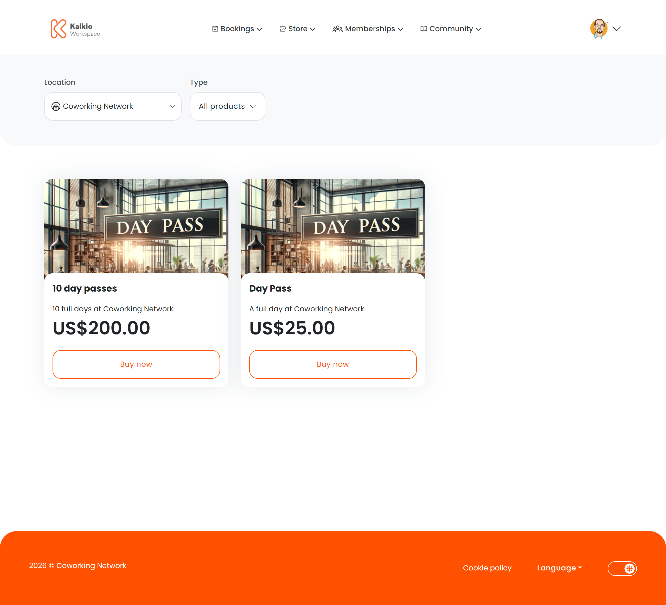
The store page is a browsable catalogue of all products available for purchase — memberships, time passes, add-on services, and physical goods.
 ## What members see
Products are displayed in a responsive grid. Each product card shows:
* **Product image**
* **Product name and description**
* **Price** (in the location's currency)
* **Out-of-stock badge** when inventory is depleted
Clicking a product card navigates to the individual [Product Checkout](./product-checkout) page.
## Filtering
| Filter | Description |
| ---------------- | ----------------------------------------------------------------- |
| **Product type** | Filter by category — memberships, passes, products, add-ons, etc. |
| **Location** | Filter by business location (multi-site setups) |
The store URL supports type-based routing (`/store/all`, `/store/:type`) so you can link directly to a filtered view.
## Key features
* **AI-assisted recommendations** — an optional AI prompt suggests products based on the member's needs.
* **Authentication awareness** — unauthenticated visitors see login/signup prompts. Non-members see relevant guidance.
* **Dynamic pricing** — prices respect location billing settings and hide when billing is not enabled.
* **Responsive grid** — card sizes adapt to screen width with configurable minimum widths and gaps.
## Configurable sections
| Setting | Default | Effect |
| ---------------------- | ------- | ------------------------------------------ |
| Show filters | On | Display the filter bar |
| Show product types | On | Show the product type dropdown |
| Show location selector | On | Show the location filter |
| Show description | On | Show product descriptions on cards |
| Show price | On | Show pricing on cards |
| Show image | On | Show product images |
| Grid gap | 1.5rem | Spacing between cards |
| Min card width | 300px | Minimum card width for the responsive grid |
***
## Recommended image sizes
Products use a single image that is requested at different sizes depending on context.
| Where it appears | Requested size | Aspect ratio |
| ------------------------- | -------------- | ------------ |
| **Store listing cards** | 600 × 540 px | \~1.11 : 1 |
| **Product detail page** | 600 × 540 px | \~1.11 : 1 |
| **Checkout confirmation** | 600 × 540 px | \~1.11 : 1 |
| **Basket thumbnail** | 220 × 220 px | 1 : 1 |
For the best results, upload a product image of at least **600 × 540 px** (nearly square). This covers the largest requested size without cropping. Keep the subject centred so it looks good when cropped to square for basket thumbnails.
## What members see
Products are displayed in a responsive grid. Each product card shows:
* **Product image**
* **Product name and description**
* **Price** (in the location's currency)
* **Out-of-stock badge** when inventory is depleted
Clicking a product card navigates to the individual [Product Checkout](./product-checkout) page.
## Filtering
| Filter | Description |
| ---------------- | ----------------------------------------------------------------- |
| **Product type** | Filter by category — memberships, passes, products, add-ons, etc. |
| **Location** | Filter by business location (multi-site setups) |
The store URL supports type-based routing (`/store/all`, `/store/:type`) so you can link directly to a filtered view.
## Key features
* **AI-assisted recommendations** — an optional AI prompt suggests products based on the member's needs.
* **Authentication awareness** — unauthenticated visitors see login/signup prompts. Non-members see relevant guidance.
* **Dynamic pricing** — prices respect location billing settings and hide when billing is not enabled.
* **Responsive grid** — card sizes adapt to screen width with configurable minimum widths and gaps.
## Configurable sections
| Setting | Default | Effect |
| ---------------------- | ------- | ------------------------------------------ |
| Show filters | On | Display the filter bar |
| Show product types | On | Show the product type dropdown |
| Show location selector | On | Show the location filter |
| Show description | On | Show product descriptions on cards |
| Show price | On | Show pricing on cards |
| Show image | On | Show product images |
| Grid gap | 1.5rem | Spacing between cards |
| Min card width | 300px | Minimum card width for the responsive grid |
***
## Recommended image sizes
Products use a single image that is requested at different sizes depending on context.
| Where it appears | Requested size | Aspect ratio |
| ------------------------- | -------------- | ------------ |
| **Store listing cards** | 600 × 540 px | \~1.11 : 1 |
| **Product detail page** | 600 × 540 px | \~1.11 : 1 |
| **Checkout confirmation** | 600 × 540 px | \~1.11 : 1 |
| **Basket thumbnail** | 220 × 220 px | 1 : 1 |
For the best results, upload a product image of at least **600 × 540 px** (nearly square). This covers the largest requested size without cropping. Keep the subject centred so it looks good when cropped to square for basket thumbnails.